
I will admit straight off that I didn’t think that I would enjoy this module. I’ve never had much of an interest in animation, or learning about moving image, so I had no idea of what to expect. I have tried to keep an open mind throughout the process of designing and producing my animations, and continually thought about how I feel about digital media as a whole.
During this module I have discovered several things about myself as a designer, about digital media and where I fit in the world of digital media; I am not very good at thinking in three-dimensional space, or about thinking of things on a screen, and translating my ideas. I have found it quite difficult to come up with ideas that I think are achievable using the software available to me, but still trying to push myself to try new things. I enjoyed the Silent Movie brief, because we were able to play with the words, and had a definite structure to the animation. It was also quite easy because it was meant to be very simple, and I like keeping things simple. From the initial brief, the Top 10 animation was much harder to get my head around, and more difficult to design.
I think that my ideas for the animation were good, and fitted well with the subject matter I had chosen from my research. I know that my skills with Adobe After Effects are not very good at all, and I think that this is where my animation may have suffered. I like the final outcome enough to not want to start all over again, but I know that there are a lot of things I could have done much better, if I had the knowledge of the software.
That being said, I have developed my skills in After Effects. I am glad that I have tried out different types of animation, and learnt new skills that I would never have wanted to learn, had we not been given this brief. I am hoping that the skills I have learnt will come in useful at some point, even though I do not intend to pursue digital animation as a main interest.
Using the iWeb software has been interesting, and something that I think will come in very useful for future briefs. I have learnt to use the entire program during this brief, and I really like how simple it is to use, if frustrating at times!
If I were able to improve on this module, I think that mainly my skills in After Effects would need to be much better. This is something that I had never tried before, and I think that this is a big drawback when it comes to learning something whist producing work. I would also like to try producing an animation based of different subject matter, possibly something more fun and dynamic. I do not think that my subject matter gave me the best starting point for this brief.
One of the main frustrations of this entire module has been relying on digital information. I have been lucky that I have not lost any work in a significant way. I have, however, had several set backs with my animation and iWeb which has been so irritating and wasted a lot of my time. Using iWeb seemed very easy at first, but file sizes became a big problem. With After Effects, some of my files would not show in the animation, when they had been working fine; this meant having to repair the links and
re-animate an entire section. I know that we were warned of technology letting us down; I’ve tried to be really careful with saving my work and files etc, but I have been let down by some of the software.
I am slightly sorry to say that digital animation is not something I really want to try again in a hurry. This brief has been quite stressful when I initially thought I was really going to enjoy it. As a designer I realise the importance of digital animation and media design, I just know that it is not area that I excel in. My favourite part of this whole module has been learning iWeb. I have developed skills here that I will definitely use in the future; I may even present more of my prep and support work using iWeb based files.
Thursday 12 February 2009
Sunday 8 February 2009
Post Crit...
I have listed all the advice given to me from our crit feedback forms;
1. Focuses for too long on the lines
I have tried to speed up the line movement, so that it doesn't focus on the line for too long, but connects to the genre elements faster
2. Work on pace
I have tried to adapt the parts that were too quick and parts that were too slow, so that they fit better with the overall animation
3. Make the animation shorter
I can't do this as it would not fit the requirements of the brief, it currently runs for 38 seconds
4. Add sound to strengthen image
I have chosen music that I want to use for the animation, I do not want to use actual sound effects for the genre elements, as there aren't really sound effects that fit with each one. I have chosen sound that doesn't take away from the imagery, but makes the overall piece stronger, and a typewriter effect at the very end, that fits with the animation
5. Change the website so that it fully matches the animation
I do not want to change the website design for several reasons; it is basically finished so changing it would be a rather large job, something that I do not have time for. Also, I have used the same colour scheme as the animation, but used non of the images from the animation and kept it very simple, as I don't want to give away the animation content. I do not want to make the design too complicated as it it meant to be a reference point for all my design work.
6. Add colour to the animation
This is something that I considered at the very beginning, but decided not to include. I am using cream/buff paper and black/black paper. I wanted to keep the design very simple, to represent ink and paper, something that I associate very strongly with authors and literature, similar to the typewriter element.
I hope that I have addressed the main issues that were brought up during the feedback crit, and that I have sufficiently explained the changes and elements I have decided not to change.
Friday 30 January 2009
iWebsite...
I've gotten very carried away with trying ideas out on After Effects, building my website using iWed and generally working, that I've forgotten to put stuff up on this blog about how the website design is going.
Here are some examples of the pages that I have created for the website. The first set shows pages that relate to this current brief, the title sequence. The lower set show the process of making my Silent Movie animation.
The overall website currently contains 49 separate pages, and this will definitely increase by the time I've finished this project. I have found using the iWeb software fairly easy, it's just drag and drop really so it makes it very simple to design and arrange pages. Anyway... here is what I have been designing...


Friday 16 January 2009
Wednesday 14 January 2009
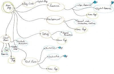
Navigation Schematic...
These images are diagrams that show the navigation of the pages within the website. These diagrams make it easy to put the website together, and make sure that everything links back to the right pages.


Design my website...
We had our introduction to iWeb today, and I have discovered that it is very easy to use, which is great as After Effects is quite difficult - it feels like the balance has been redressed.
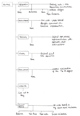
Anyway from here on I am going to be using my blog to document how I build my website. The website is going to display the process of producing my Top 10 animation. We have been instructed to include information regarding research, development, test pieces, finished resolutions and all the work done for the Silent Movie brief completed before Christmas.
These are the initial layout designs for the homepage (the subsequent pages would follow a similar format)

Tuesday 13 January 2009
Audi A5 Rhythm of Lines...
I'm considering using line drawing in my title sequence, Sara mentioned that the Audi advert uses lines...so here it is. I quite like it, but don't think there is enough 'car' in it


Saturday 10 January 2009
Animations and Stings...
Here are a few animation things that I've found, and quite like.
Some of them are a bit weird, the content isn't great, but I like the styles of animation, 'illustration' and general design
Interesting, not sure if this is digital animation or stop frame, but I really like the textures and character design
This is funny - clearly digital animation
Hand drawn images mixed with film, possibly stop frame animation
Really clever digital animation of an animation - a little confusing, but cool
Old style stop frame animation, interesting characters and style
The Channel 4 idents that have the weird floating pieces - I've always liked these, and I think they're quite innovative and different to what you usually get from TV channels
Two Channel 4 idents from the 90s, quite simple digital animation, but effective
These are the 2001 - 2007 BBC2 idents, with the number 2 getting up to all sorts of things, digital animation
E4 idents - or E-stings as they like to call them. A lot of these are produced by members of the public who just send them in.
More E4 idents:
Friday 9 January 2009
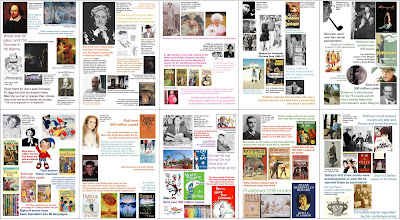
Top 10 Research....
I have researched the Top 10 Best-selling authors (of all time, in the world, ever..etc)
1. William Shakespeare
2. Agatha Christie
3. Barbara Cartland
4. Harold Robbins
5. George Simenon
6. Enid Blyton
7. Danielle Steel
8. Dr Seuss
9. Gilbert Patten
10. Leo Tolstoy
1. William Shakespeare
2. Agatha Christie
3. Barbara Cartland
4. Harold Robbins
5. George Simenon
6. Enid Blyton
7. Danielle Steel
8. Dr Seuss
9. Gilbert Patten
10. Leo Tolstoy

Wednesday 7 January 2009
Bond...
I've seen these on several blogs now...and each one seems to say the same thing - 'nice on screen type they've used, in keeping with location' etc. On the whole I agree with them, interesting and nicely subtle, if a little cliche. Still, here they are, I'm sure you've seen them already, but what the hell...


Audi Q5 Ad...
I just saw this on tv and I love it! So clever, and simple and...it makes me want a car made from cardboard!
Subscribe to:
Posts (Atom)
